Immigration forms
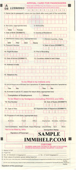
When you’re travelling to a foreign country, your first impression of what it’s like to deal with their government often comes from the design of the immigration cards. This is what visitors to India see:

Do you see the label that says “DD/MM/YY” next to year fields with four boxes? Or the 5-question section “to be filled by foreigners, NRIs, PIOs and OCIs” where three questions have an asterisk that says “Not to be filled by NRIs, PIOs and OCIs? Or the inconsistent labelling, capitalization, box widths and alignment? Overall, it gives visitors a pretty accurate picture of what India’s like.
While the immigration card’s poor design is great for managing expections, I thought it would be an interesting exercise to redesign it. As with any design exercise, identifying the constraints is pretty important. These are the restrictions I identified.
- None of the fields in the existing form, no matter how pointless they may seem, can be removed. Not even the one that says “Countries visited in [the] last 6 days” which is too long for a number and too short for a list of countries.
- The cards must be sized to fit in a passport.
- There can only be one variant; it’s not possible to issue separate forms to Indians and foreigners.
- The key fields need to be OCR-scannable.
Given these constraints, the objective is to minimize the amount of time people have to spend filling these out. A secondary objective is to reduce the time that immigration officers have to spend to process it.
The redesigned experience #
Currently, there’s an arrival card (handed out on the flight into India) and a departure card (handed out at check-in for the flight out) which ask mostly the same questions. There’s also a customs declaration attached to the arrival card, which is torn off at immigration and handed to the customs people at the exit.
Most Indians leave the country and return after a short trip, while foreigners and non-resident Indians arrive and then leave after a short time. Only in a minority of cases is there a significant gap (say over a month) between the first journey and the next.
The new cards have both the arrival and departure forms printed on the same piece of paper, separated by a perforated line. When the form is folded at the perforation, the departure and arrival forms line up behind each other. Fields that are common to both forms are placed in exactly the same position and have a carbon layer at the back, so filling the one in front would fill the one behind as well. When folded along the two lines shown, the card fits easily into a passport.
Indians pick up the forms at airport check-in, fold them so the departure side is on top, and fill it. Most of the information on the arrival side gets filled as well. Outbound immigration officers tear at the perforation, keep the departure side and leave the arrival stub in the passport; Passengers retain this stub during their trip, and when they return they fill in the remaining information (return flight number, date) and hand it over to inbound immigration.
Foreigners follow the same process, but start off with the forms folded the other way (arrival side up) and carry the departure side in their passport while they’re in India.
Retaining one part of the stub in the passport also serves as a bookmark for the page which has the immigration stamp, which helps speed up the process at immigration on the return journey. Arrival and departure cards printed together can have matching serial numbers, which can help track trips made.
Conclusion #
The immigration card is an anachronism that can hopefully be done away with at some point – for example the Schengen area (most of the European Union) doesn’t use them. Short of that, I suspect that many of the questions on these forms can be removed; the Indian form is one of the most complex I’ve seen. However both these changes are incredibly hard given the glacial bureaucracy that runs our government. This exercise was therefore intentionally constrained to what can realistically be implemented. Even within those constraints, it looks like very real gains in ease-of-use and efficiency are possible.
Did I miss any obvious improvements? Are there significant problems with the new design that I’ve failed to notice? Let me know in the comments.
